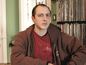
Muralist Joe Barillaro was chosen to bring his unique style of design to the Morse-Kelley Playground. – Photo by Harry Kane
By Harry Kane
Morse-Kelley Playground is receiving a hip and edgy makeover and with it, the parks department has commissioned a local muralist to create a wall painting.
Somerville artist Joe Barillaro is producing the mural. Based near Porter Square in Somerville, he’ll work out of a small studio on the other side of the train tracks where two buddies, one a photographer and the other a silk screener, will allow him the use of their studio space to paint the several 4 by 8 panels for the mural.
City spokeswoman Luisa Oliveira had this to say about Barillaro: “Joe has been very good at listening to the community and engaging their ideas and feedback. He was chosen for his ability to meld positive messages though edgy street art and his murals are a great asset to Somerville’s public art. We are excited to see the community’s ideas interpreted through his artistic lens.”
Two tentative designs for the mural are in sketch form but no decision has been made on the final concept, though there is a consensus that the mural should be hip and edgy to go along with the new skateboarding elements introduced in the park. The park will be re-opening this spring.
Save Our Somerville, who has been at the forefront of making the dream of a skate park into a reality, helped with the design ideas for the mural in a meeting on Jan. 17.
SOS encouraged Barillaro to paint a memorial scene in the mural for all the kids whose lives had been cut short prematurely due to drugs.
There are “two glaringly different examples, and either they will meet at halfway or there will be more positive sentiment towards one or the other,” Barillaro said.
The first design is a literal interpretation of fun activities in Somerville. It’s a huge scene of children being mentored, playing sports, kids skateboarding, hopscotch, and Somerville landmarks.
Alderman Tom Taylor supported with the first design. “The mural should reflect the diversity of the city and perhaps reflect some of the activities that will be available in Morse-Kelley Park. That would be my preference.”
The second design is more edgy and urban; a bold piece with a positive vibe fused with expressive and playful faces.
Barillaro may use cubism types of compositions, designing people in a cartoony and expressive way and orchestrating the figures and buildings in an abstract overlapping design.
An emphasis on background elements like shapes, arrows, bubbles or clouds would be prevalent in the second concept.
His color palette will depend on the concept, but once his framework is set the design of colors flow naturally. “I put one color in that I like, and every other color is a reaction to that. It just intuitively builds from that,” Barillaro said.
“The graphic element is a big part. It’s immediate gratification, a cohesive one solid image. I’m hoping to bring some life to the park…I’m hoping it will be a highlight of the park.”
No matter what the design is, Barillaro feels that his skill will allow him to produce a successful eclectic mural that will help spotlight the playground.







Reader Comments