By Julia Fairclough If you walked by a store window that was so cluttered with merchandise you could hardly see in the window, would that make you want to go in and spend some money? It's doubtful. So curb your enthusiasm. Overloading a store window will only serve confuse the customer. You must lure them in by highlighting what you sell, give them a compelling reason to enter the store, said Christine Graber of GraberMarketing during the city's Best Retail Practices program at City Hall last Thursday. Graber offered some marketing tips and pointers on how to provide storefront improvement. |
||||
Sidewalk and window appeal are critical to a businesses success, and people must project a good image, even at a distance. Think of peoples' attention span, and how little time business owners have to get someone driving by to notice them.
A good example of a simple yet eye-catching sign is Carberry's café and bakery on Prospect Street in Cambridge, Graber said. You can see the sign stretching across the storefront in a primary-colored blue from quite a distance. The font is simple.
Font style is important. For example, Cuchi-Cuchi in Cambridge uses a curlicued font that speaks to the romantic quality of the restaurant. The restaurant name alone is easily remembered, Graber said.
Stabella's toy store on Cambridge Street in Cambridge is a nice example of a tasteful display, she said. Items are neatly arranged and don't block the view into the store. People should remember that the inventory should tease people into the store. Tell a story with the merchandise to give customers a compelling reason to enter.
"People used to put prices in the window, such as what you'd see with shoe stores, to get people to come in," Graber said. "But you don't see that anymore. You have to try something else."
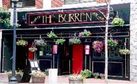
Another pleasing storefront is the Burren in Davis Square. Cascading planters give the Irish pub a real authentic feel.
People can also continue to sell merchandise even after the store is closed, by using artful lighting, Graber said.
Other tips include the following:
o Use universal symbols, such as a heart for Valentine's Day or a pumpkin for Halloween. Being too clever with a symbol can confuse the customer.
o If you want to sell multiple items together, display them in a group. For example, a salon can cluster together shampoo, conditioner, and a hair brush.
o Put a mirror in the front window so people walking by can see themselves. It's a psychological message to put someone in a store before they enter the front door.
o The first impression is the threshold appeal. Put your best seller three to four feet into the store.
o Make sure that aisles are spacious, and wide enough to withstand a baby stroller. "Think of how you feel in Nordstrom's, with those wide aisles that give you plenty of breathing room," Graber said.
o Add a destination point at the back of the store comprised of items that are just as compelling as those in the front doorway. This will ensure that customers walk throughout the store.
o Consider interior colors, and how it speaks to the mood of the store.
o The service desk is the last bastion. It will reflect your personality. You want it to be warm and welcoming, and not about how much money customers will spend in the store.
o Think about shelf appeal when stacking tee shirts, a particular item that is hard to display. Some people will hang examples of the tee shirt designs on the walls, with the rack below.
o Jewelry displays can be overwhelming. Consider putting items on one drawer pulled out for display, then keep the boxes stocked behind it.
o Keep displays fresh. Rotate products around the store and organize by style, then color. Customers will look at your items with a fresh eye.
o Communicate with customers, even in silence. You can place signs around the store, such as, "Consider this for Mother's Day," and so on.
o Signs should not be hand written, which can look sloppy and unprofessional.
Visit http//:grabermarketing.com for more information about GraberMarketing.


Reader Comments